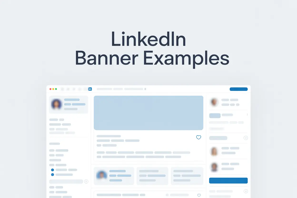
According to LinkedIn, profiles with visuals get 21x more profile views than those without.
Your cover image is the first thing people see, before they read your LinkedIn headline or your posts.
It’s your personal “billboard” that tells visitors what you do and why they should care.
In this article, I’ll show you 10 real LinkedIn cover image examples from creators, founders, and marketers who use their banners to stand out and attract the right audience.
You’ll see what works, why it works, and how to create your own version that fits your personal brand.
Why Your LinkedIn Cover Image is Important?
Your LinkedIn cover image is important because it’s the first thing people see when they visit your profile.
Before they read your LinkedIn headline or scroll through your experience, your banner shapes how they perceive you and what they expect from your content.
A strong LinkedIn cover image:
- Creates your first visual impression.
- Reinforces what you do or what you stand for.
- Makes your profile look intentional, not empty.
- Helps you stand out in searches, recruiter tabs, and connection requests.
If you’re using LinkedIn Premium, you can also add a slideshow-style cover image, allowing your banner to display multiple visuals or messages in rotation (I will list some examples below).

If you want to know more about LinkedIn Premium features, have a look at this article: LinkedIn Free vs. Premium
10 LinkedIn Banner Examples to Get Inspired
Here are 10 examples that show how the right banner can shape your personal brand and attract the right audience.
1. The Expert in Action (Tech Creators & Developers)
Here's a LinkedIn cover image example of showing authority without a single word.
The banner shows the creator speaking on stage, surrounded by lights and cameras. It is a visual cue that directly communicates expertise and confidence.

Using an authentic photo in action builds instant trust. It tells visitors, “I don’t just talk about this, but I do it.”
This is best for developers, educators, or creators who share knowledge publicly. A real-life moment like this makes your profile far more memorable than any stock image could.
2. The Branded Educator (Coaches & Mentors)
This LinkedIn cover image uses a clean layout with consistent color tones and the title of a personal newsletter.
It feels intentional and balanced. Simple enough to look professional, yet recognizable across every platform.
The design reinforces one clear message: this person creates valuable educational content.
For coaches, consultants, or mentors, keeping your brand identity visible through your banner helps people remember who you are and what you offer.
Even small details like fonts or colors can make your profile look cohesive and credible.
3. The Corporate Professional (Leaders & Executives)
This banner shows a minimalist background featuring the phrase “Create the Future of Sport.”
It reflects the company’s mission while staying elegant and uncluttered. There’s no need for extra logos or text; the visual connection to the brand speaks for itself.

For executives or corporate leaders, a simple, well-aligned banner like this communicates professionalism.
It connects your personal identity with your organization’s purpose, showing both confidence and clarity.
4. The Value-Driven Marketer (Founders & Consultants)
This LinkedIn cover image says exactly what the person does: “I scale businesses with SEO and content.”

It’s clear, direct, and instantly communicates value. No extra design, no buzzwords, but just a simple statement that tells visitors what to expect.
For marketers, consultants, or agency founders, a banner like this works as a quick elevator pitch. It turns profile views into potential leads by showing what you do and who you help at a single glance.
If you’re a marketer thinking about posting more on LinkedIn, I wrote an article with plenty of examples to help you get started. You can read it here: LinkedIn post ideas for marketers.
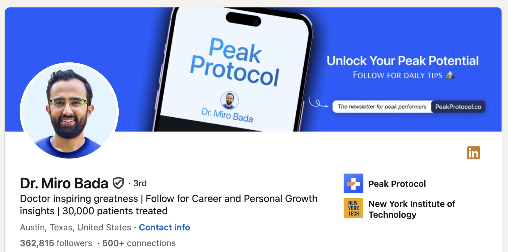
5. The AI Consultant (Tech & Innovation Leaders)
This banner uses a dark, minimalist background with bold white text that reads “AI-Powered Business Growth.”
It’s straightforward and powerful, making expertise clear without relying on complex visuals. The contrast between dark and light gives it a confident, professional feel.

For professionals in AI, marketing, or tech innovation, a banner like this communicates focus. You don’t need intricate design elements, but just a clear message that defines your niche.
💡 With Podawaa, you can target the right audience and boost your LinkedIn post visibility with more likes and comments (from real people).
Try Podawaa for Free →6. The Media & Newsletter Builder (Writers & Creators)
Next banner on the list highlights a newsletter URL using bold typography and high contrast between text and background.
It directs visitors to exactly where they can find more content. In this case, a newsletter about finance and technology.
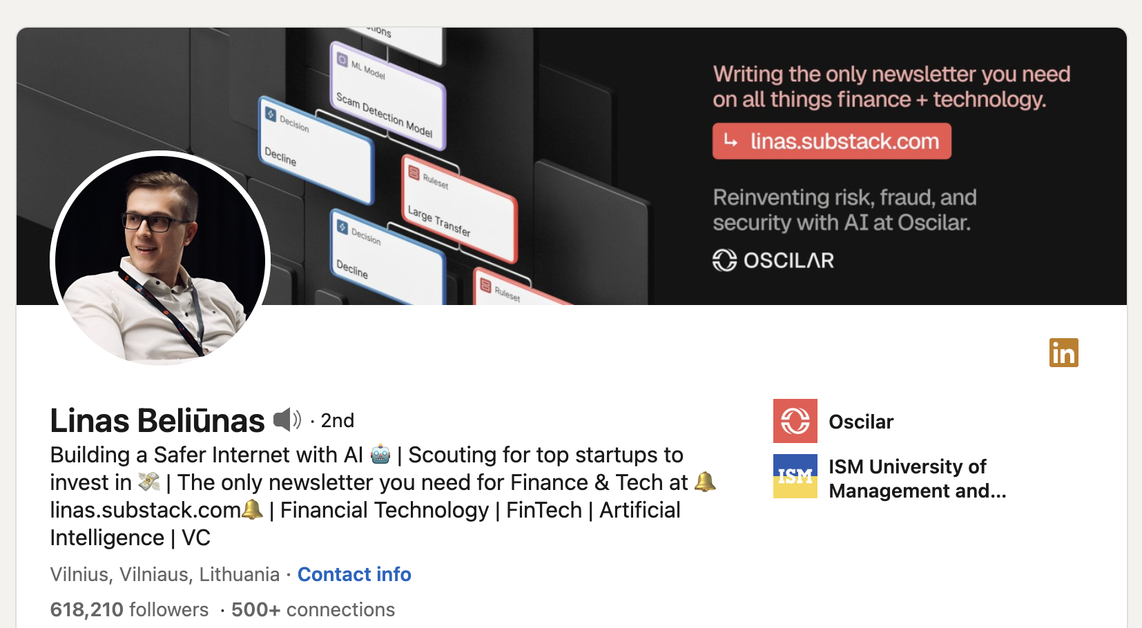
For writers, journalists, or media creators, this layout works as a personal landing page. It’s simple but intentional, helping your audience connect your LinkedIn profile to your main platform or publication.
7. The Mission-Driven Brand (Personal Branding Experts)
This banner uses a bold quote: “In an AI-driven world, human trust is everything.”
The warm colors and strong typography make it feel emotional and memorable, showing both confidence and clarity of message.
It’s also designed as a LinkedIn Premium slideshow banner, allowing multiple visuals to rotate. Each slide reinforces the same message (purpose and trust) in different ways.
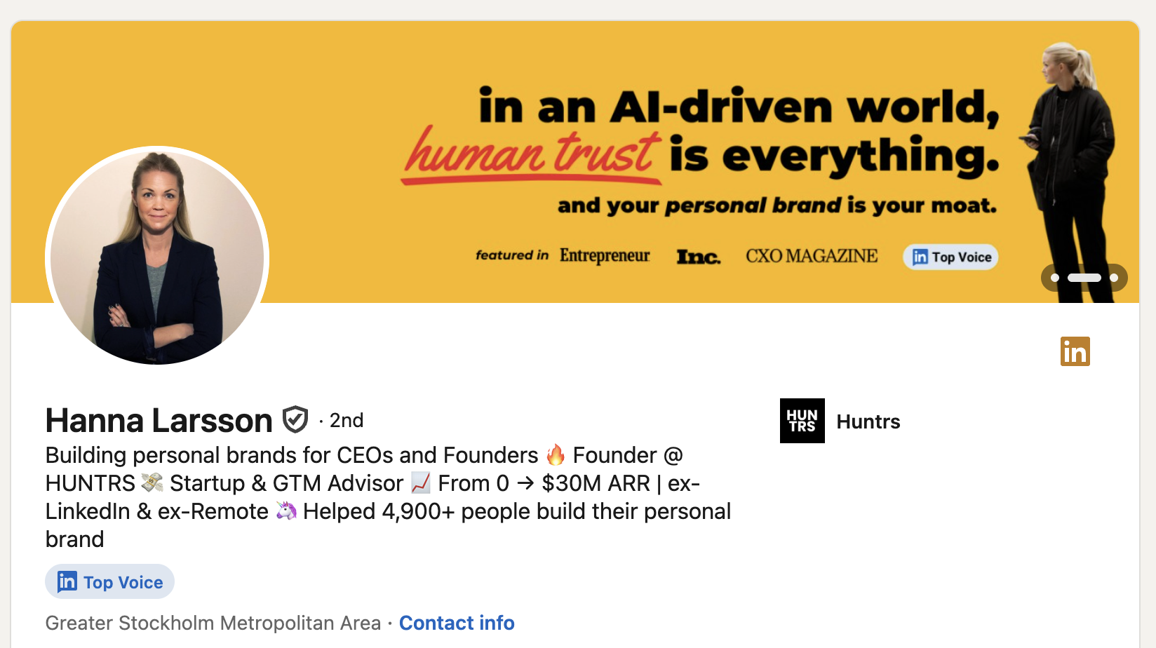
This works well for personal branding experts, founders, or leadership coaches who want their philosophy to stand out. It communicates values before visitors even read your headline.
If you’re exploring visual formats, check out my guide on LinkedIn carousel post examples to see how creators use carousels to boost engagement and tell better stories.
8. The Executive Coach (Consultants & Advisors)
This banner combines soft background tones with clear typography and trusted brand logos like Shopify and IBM.

It looks professional without being stiff, creating a balance between credibility and approachability.
For consultants or executive coaches, including recognizable client names is a subtle but effective credibility signal. It tells visitors that your experience is backed by results.
9. The Transformation Story (Educators & Founders)
This banner uses a simple visual metaphor: a line graph showing progress from “this → to this.”
Without any extra text or logos, it clearly communicates growth and transformation.
As a LinkedIn Top Voice, this creator uses visuals to reinforce his message of progress and learning. It’s an easy way to show authority without ever writing “expert” in your headline.
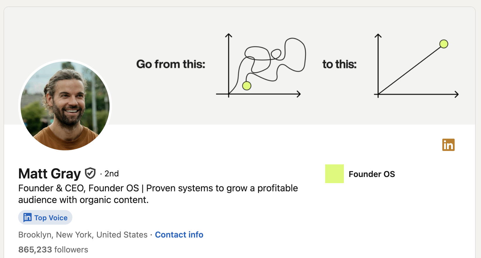
For educators, business mentors, or founders, this style of banner works perfectly when your value lies in helping others improve. Visual storytelling makes the message easy to understand and hard to forget.
10. The Minimalist Personal Brand (Writers & Creators)
The last LinkedIn cover image on the list features a clean lavender background with white text that reads LinkedIn creator and her name.
It’s simple, calm, and immediately tells visitors who the person is and what they do.

It’s also set up as a Premium slideshow banner, alternating between short identity statements and visual cues, perfect for creators who want a modern, polished touch without overdesigning.
For writers or designers who prefer subtle branding, this approach keeps focus on your name and title. It proves that simplicity and consistency often make the strongest impression.
Quick Design Tips for a Great LinkedIn Cover Image
Designing a good banner doesn’t have to be complicated. You just need a few basics in place to make it look clean, professional, and aligned with your LinkedIn personal brand.
1. Recommended size: 1584 x 396 px. This ensures your image fits perfectly on both desktop and mobile.
2. Use contrast: Choose colors that make your text stand out and don’t blend with your profile photo.
3. Keep important text to the right: Your profile photo overlaps the left side of the banner, so always place your logo, tagline, or message on the right.
4. Use simple tools: Canva, Figma, or Notion banners work great for creating professional designs quickly. Here’s a quick example using Canva:
- Less is more: Avoid clutter, random stock photos, or too much text. A clean layout always looks more intentional.
Optimize Your Profile. Then Let Your Content Do the Talking.
Building a personal brand doesn’t stop with your profile. Once it’s optimized, you need to show up consistently. Posting is how people discover your voice, your ideas, and your expertise.
An AI-powered LinkedIn assistant like Podawaa will help you post smarter, reach the right audience, and grow engagement faster (all while saving time).
As a result, using Podawaa, you will get more profile views, more comments around your content, and more followers.
💡 With Podawaa, you can target the right audience and boost your LinkedIn post visibility with more likes and comments (from real people).
Try Podawaa for Free →